Sneak peek: Accessibility Addon refresh
How we're overhauling the Accessibility Addon in Storybook 9.0

With incoming laws like the European Accessibility Act taking effect in June 2025, teams are scrambling to ensure their UIs are accessible. Storybook is here to accelerate your path to WCAG compliance.
I’m thrilled to share a sneak peek of Storybook 9’s updated accessibility workflow, including a redesigned addon, automated checks in CI, and more.
You’ll also get the chance to sign up for early access to Chromatic’s Accessibility Regression Testing—a new tool that integrates with Storybook to help you manage accessibility debt and prevent new violations.
What’s new in the Accessibility addon
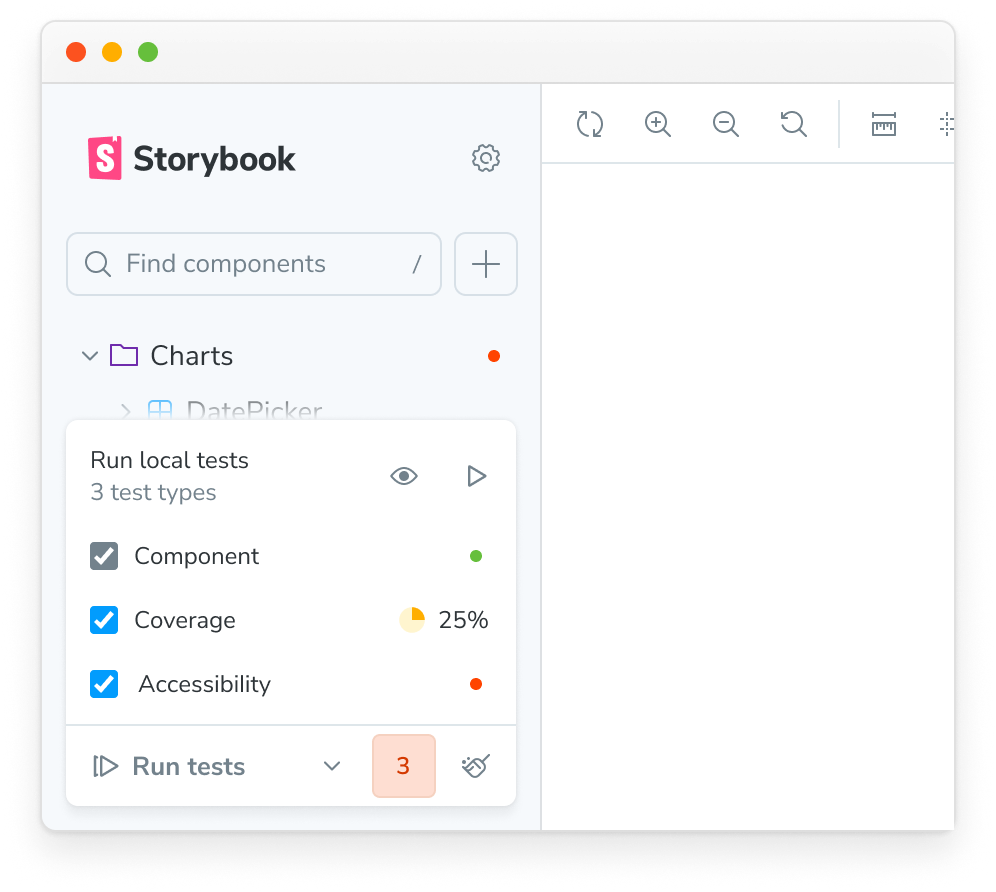
Redesigned layout
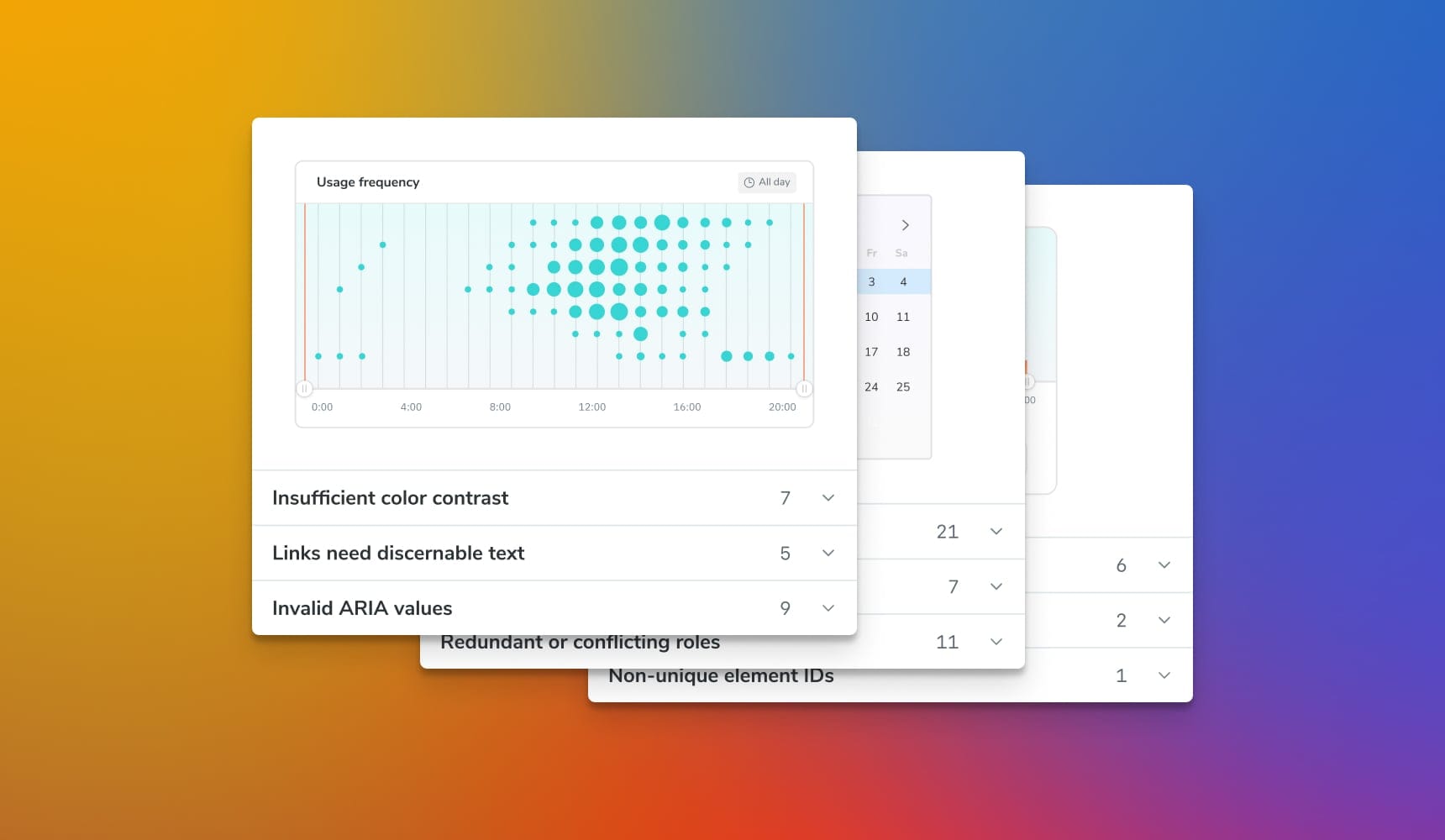
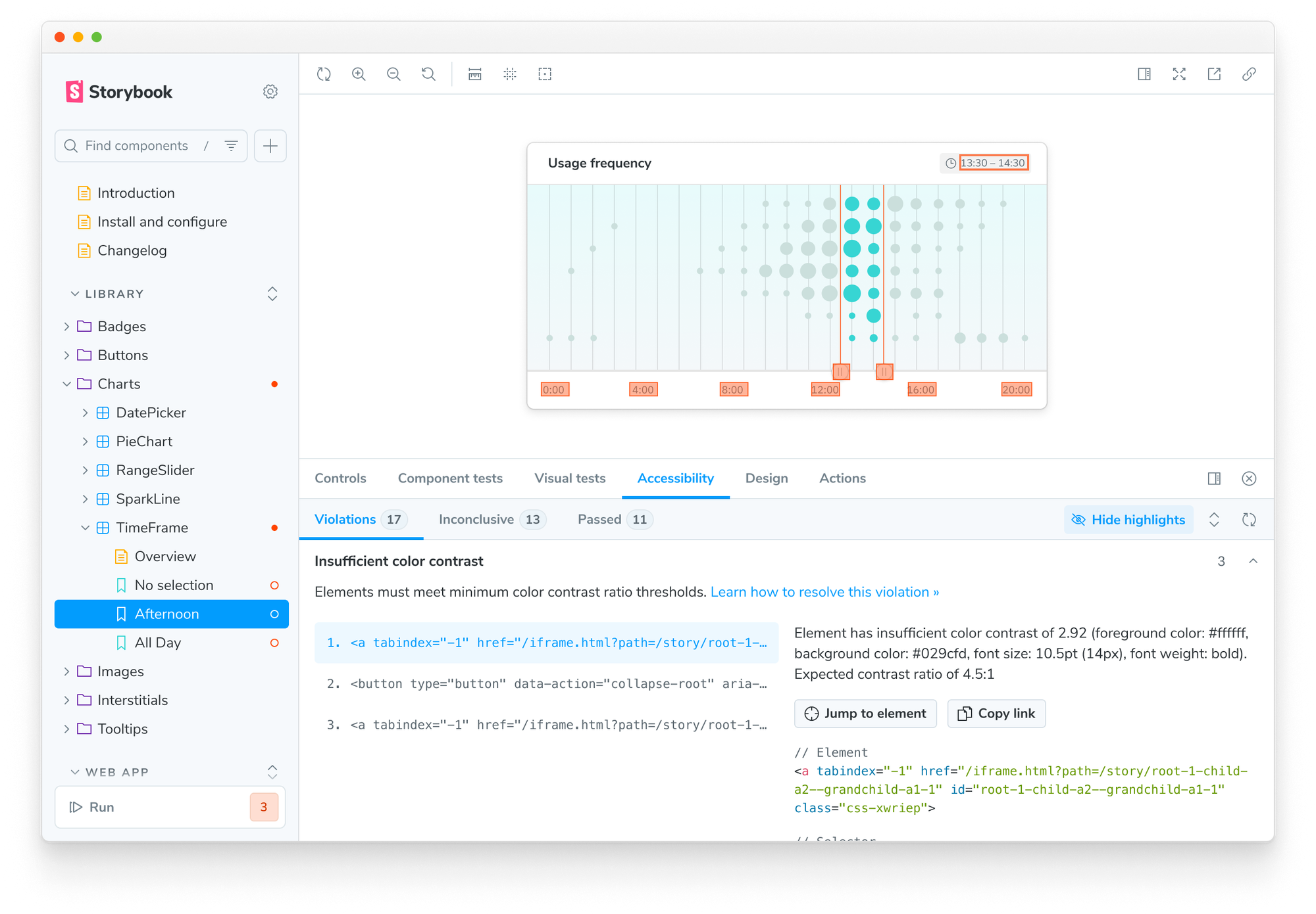
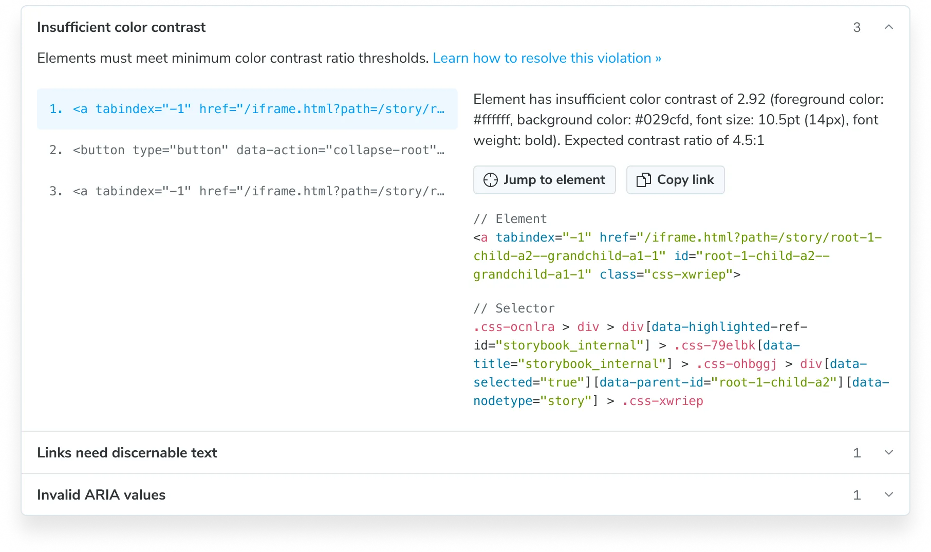
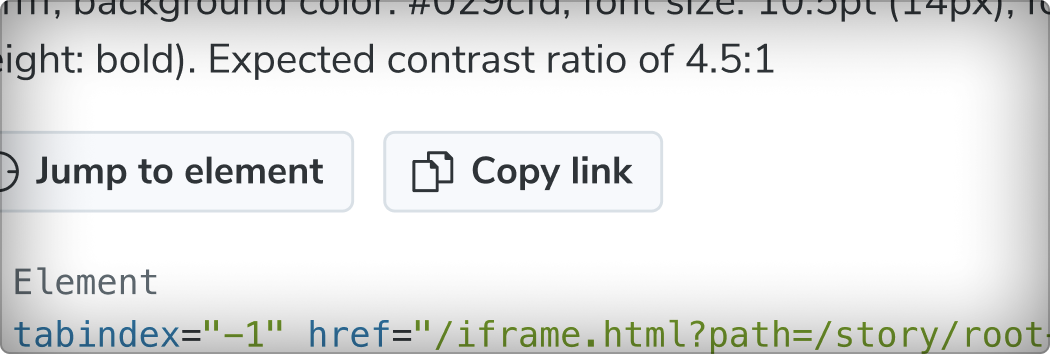
The addon now displays accessibility violations grouped by rule, with elements listed under each.
Instead of a noisy, flat list of violations, you get a structured breakdown. Quickly scan through failed rules, then drill into specific elements.
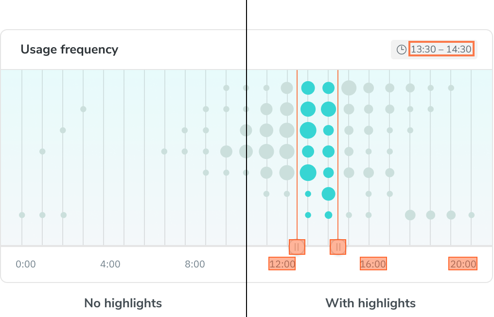
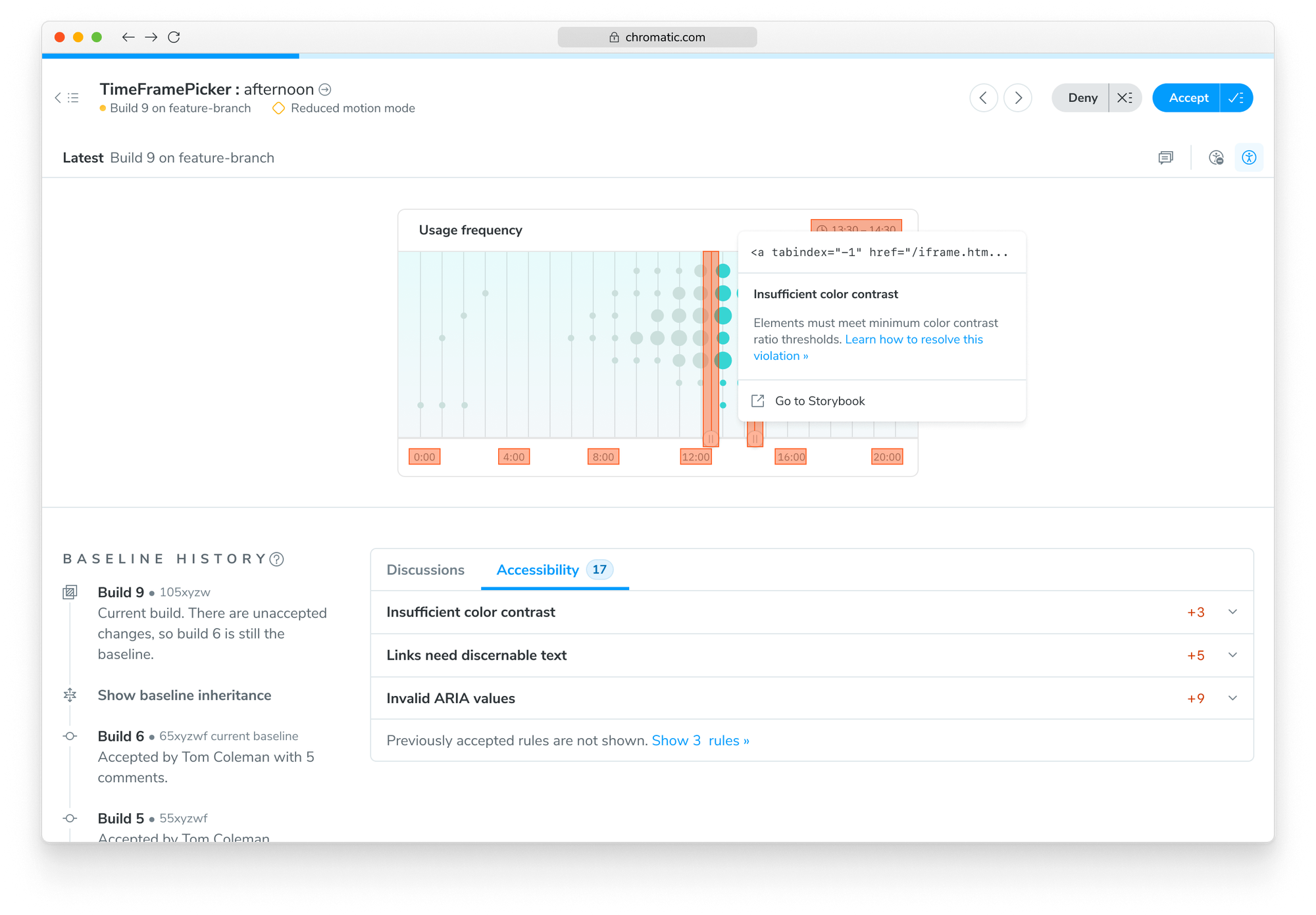
Highlight issues in the canvas
Click any violation to highlight the corresponding DOM node in the canvas. Debugging becomes visual and interactive—you no longer need to fumble with selector soup to figure out what failed.
The addon puts the issue in context, showing you the rendered UI right alongside the accessibility failure. That means faster fixes and fewer tool-switching headaches.
Share permalinks to rules and elements
Every violation now has a unique, shareable permalink. Accessibility is a team sport—and these links make it easy to bring in your resident expert, designer, or PM.
Share a direct link to any issue inside a published Storybook, complete with rendered UI and context. That’s especially helpful for distributed teams debugging async.
Rerun accessibility tests in addon
There’s now a “rerun” button to manually trigger tests. This is especially useful for stateful UIs or interactions that modify appearance—where the first render isn’t the final state.
Runs in Storybook Test automatically
Storybook Test is a new feature landing in 9.0 (May 2025) that runs functional, coverage, and accessibility tests—all in one go. Click the test widget anchored to the bottom of the sidebar to test every story during development.
In addition, Storybook Test runs in CI to give your team another layer of protection. You already rely on stories to express component states—now they double as accessibility test cases.
Accessibility Regression Testing in Chromatic
The revamped addon lays the foundation for Accessibility Regression Testing, a new Chromatic feature that tracks accessibility violations over time and prevents regressions from creeping into your pull requests. This matters because most teams have accessibility debt that can’t be fixed all at once, they need a way to continue shipping without adding more debt.
While Storybook helps individual developers spot-check during development, Chromatic gives your entire team full coverage. It establishes an accessibility baseline for every story—so you can distinguish pre-existing issues from ones you just introduced.
Each time you push code, Chromatic automatically run accessibility checks your components across your entire Storybook. It compares current violations to the baseline. If there are any new or changed issues, they get flagged for review.
Pairing Chromatic with Storybook makes accessibility a continuous feedback loop. Chromatic protects your team from regressions and Storybook allows you to work through and fix individual violations. This ensures you never backslide—even as your app grows and more stakeholders join the process.
When can I try this?
Storybook 9 is coming May 2025 with the revamped accessibility addon. Sign up to the Storybook mailing list below to get notified of all accessibility workflow updates in the coming weeks.
Chromatic's Accessibility Regression Testing is entering beta in April. Sign up for early access now.
We're revamping the Accessibility addon in Storybook 9.0
— Storybook (@storybookjs) March 25, 2025
🔍 Rule-based layout for better readability
🎯 Highlight issues in the canvas
🔗 Permalinks for sharing
🧪 Integrates with Storybook Test
🚦 Integrates with Chromatic for regression checkshttps://t.co/kmPfgmSV1z pic.twitter.com/0Ef22Ft2zS